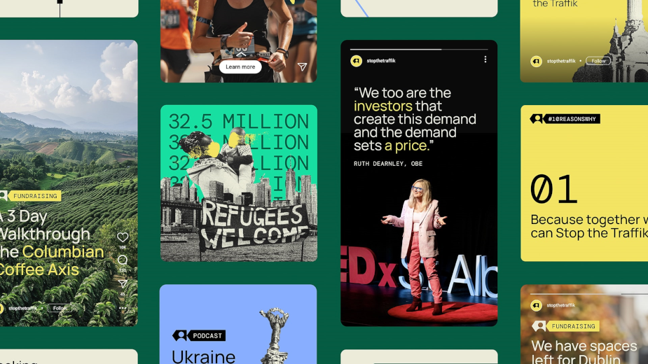
STOP THE TRAFFIK, a global charity dedicated to ending human trafficking worldwide, has revealed its new brand identity created by Fold7 Design.
The organization, which has helped millions of people over the past two decades, decided to revamp its brand to bring more attention to its important work of prevention and intelligence gathering. Fold7 Design crafted a holistic design system, featuring a unique branding device called the ‘Stop Arrow’. Unlike traditional arrows that point upward or forward, the Stop Arrow points backwards, symbolizing a focus on prevention rather than the aftermath.
The arrow serves as a universal symbol for STOP THE TRAFFIK, adaptable to different initiatives and partners while emphasizing the core mission of preventing trafficking. The new symbol replaces a distressed handprint, reflecting the organization’s modern approach to combating the issue.
In addition to the arrow, the brand includes a sub-branding system, modern typography, a refreshed color palette, and human-centered illustrations. This visual toolkit allows STOP THE TRAFFIK to address complex and sensitive subjects in a distinctive manner.
The new branding is being implemented across all marketing channels, including the STOP APP, which enables smartphone users to report suspected human trafficking incidents worldwide.
Ruth Dearnley, CEO of STOP THE TRAFFIK, commended Fold7 Design for capturing the essence of the organization and its mission. She expressed gratitude for the new brand identity, which will shine a spotlight on their efforts to prevent trafficking.
Tom Munckton, creative director at Fold7 Design, highlighted the prevention-focused approach of STOP THE TRAFFIK and the importance of creating a flexible and modern visual identity to showcase their work effectively.
The wider Fold7 agency is currently working on a creative campaign featuring the new visual identity, set to launch later in 2024. The organization’s web agency Chops Digital has applied the new identity to the Stop The Traffik website.

